I'll admit it—I like shiny things. Shimmering, reflective surfaces beguile and tempt me. As an art director and artist, I have a passion for unique and beautiful surfaces—the juxtaposition of a brilliant, rich metallic atop a matte texture, intricate foil embossing, the subtle and shifting spectral highlights of holographic diffractions—better yet, if the decoration is an effective extension of brand strategy. I know I'm not alone—in fact our brains are hard-wired for the lure of shine. Yet, despite the powerful magnetic appeal of shine, metallic effects remain an underused resource.
These days, budget is the biggest concern. Until recently, we were limited to hot foil stamping and metallic substrates to achieve the look of distinction. Afraid that clients would balk at the cost, we experimented with less expensive options, such as using faux metallic gradients or overly-subtle metallic inks. But now with inline cold foils and holographic effects that can be applied on press, suddenly shine is within reach. In reality, it always was—many brand owners realize a sizable return on investment by employing metallic effects. It’s proven that consumers have a psychological and physiological bias towards reflective packaging. The unmistakable quality of a gorgeously embossed hot foil stamp on a wine label sells more bottles than a wine critic's best review. The cool light diffractions of a holographic toothpaste package demand attention and conjure up bright teeth and fresh breath in consumer's heads.
Uncertainty about environmental impact may cause some resistance as well. Despite the fact that most metallic options are recyclable, repulpable, de-inkable, compostable, there are still some lingering myths and misunderstandings. These perceptions are clearly beginning to shift. Case in point, just the other day I was shopping at natural food market and noticed a number of metallic effects on packaging in the bath & body section. Designers and consumers are coming around to the fact that packaging does not have to look like Kraft paper to be sustainably sourced, produced and disposed of.
 Finally, the production logistics of using metallic effects can be intimidating. There's not a lot of information out there for designers, so we often feel like we are at the mercy of our print and finishing vendors. That is why I was so excited when ITW Foils asked me to help them produce "Designed to Shine" A Comprehensive Guide to Metallic Effects. The aim of the guide is to help designers gain the confidence to use metallic effects efficiently and effectively. It has been a lot of fun to produce— In the process, I had the opportunity to design with hot foils, cold foils, foil laminate substrates, transfer metallized substrates and custom holography. It's like a designer's candy shop.
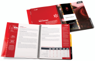
Designers are obligated to be mindful of schedules, budgets, sustainability and marketing strategy. Most of all, though, we need that ineffable creative spark to create truly differentiating work. Metallic effects are a strategically effective and fun addition to any designer's creative toolbox—more affordable and accessible than ever for those who are willing to try something different to distinguish themselves and their clients from their competitors.
This is the first in a series of design talks—join me, Christine Takacs, and guests as we voyage deeper into this intriguing sparkly universe with education, inspiration and strategy in the coming months. We also look forward to hearing about your shining design moments.
***
Christine Takacs, Creative Director for Rapt Creative has enjoyed designing print and packaging for local and international clients for nearly 20 years.